Friday, July 31, 2009

Wedding Cake Designs


Kate Sullivan is the artist of the above cakes. She makes the most beautiful unique wedding cakes in New York. Her design of these cakes is so unique people around the country are interested in investing in such art. The real question is do you really want to eat such a beautiful work of art.


These are a collection of wedding cakes by Michelle Wibowo. She runs cake shops around London England. She has unique talent for baking cakes. She makes cakes for all occasions with just as much flavor for design these imaginative wedding ones.
As you can see design can encompass even the aspects we never dreamed about design being apart of. Like even our wedding. My wedding is just around the corner and in the process of planning it I never knew how much I would actually have to design. The cake is just one of the many items necessary.

Blogs To Follow!!


This professional blog site has tons of articles on new innovations. This site blogs about the appearance and workings of the latest and rarest designed inventions. There are a variety of different inventions reviewed and talked about. Everything from water purifiers to the next car is discussed here. One blog I found most interesting was the ANTMBL a new idea for an automobile. It is completely different from anything I've heard of. They want you're vehicle to be completely redesigned and summoned by phone. You can read the story at http://www.core77.com/blog/featured_items/the_end_of_driving_mike_and_maaike_introduce_the_autonomobile_13908.asp


http://www.underconsideration.com/quipsologies/ This blogging site has a variety of different types of blogs. Some are on particular paintings that are done in series, others are on everyday designed items such as licence plates. The title of the blog site is quipsologies. There are articles on typefaces and pretty much a lot of different two dimensional works of art. The motto of this site is "Quipsologies is about sharing your interests, recommendations and intrigues: Keep it useful and fun." This is precisely what is done here. One I liked was on "Treasure Everywhere" This was a plethora of photos of old sign for stores and locations and such. It showed that there is still beauty in all the old antique signs of the time before.


Design Culture and Language


Culture has been defined as an integrated pattern of human knowledge, belief, and behavior that depends on the capacity for symbolic thought and social learning according to Alfred Kroeber and Clyde Kluchhohn in Culture a critical review of Concepts and Definitions. Design is the planning that lays the basis of everything. Another name for design is engineering of which there are different aspects of design. Language is a system of communication shared between people in the same region. Culture and Language work together in a way to allow design to occur. Culture is what causes things to been designed and influences why and how it is designed. Language allows people in their culture to communicate and initiates the discussion of how a design will be carried out. Altogether there is a power in language that allows the culture to communicate and design and engineer things for a better world.

My Design Mindmap


Here are the various areas of design. This mindmap, although armature shows just some of the different aspects that design entails. Design is such a vast subject there are so many branches of it. Even in this one I forgot ceremonies such as weddings, churches, and other many things that we couldn't place one there.

Saturday, July 25, 2009

Ads


Advertising is a big part of design in today's world. Advertisements can range from commercials to sculptures and everything in between. Generally people think of a boring commercial or a billboard with a picture of alcohol, however, there are some diverse advertisements out there that were designed to catch your attention. No everyone will stop to read a billboard or watch the commercials between televisions but advertisements such as this are hard to turn away from.

What if you were walking in the park and came across this bench? I believe that most people would take more then just a glance out of this. This took a creative designer who knew that people just aren't interested in the conventional ads. He knew that something such as a bench not really serving its purpose would draw the attention and even get the point across.
Here is another unconventional advertisement, even though it is only a picture it still has a message. From first glance you want to see why this girl has a post it on her forehead. Further examination shows that it is her name. This tells pretty much the whole story. This guy try to avoid not remembering her name in the morning after what seems to be a one night stand sticks a post it on her head to remember her name. This one again draws attention because of its uniqueness and humor.
Through examining these advertisements I would say that going the unconventional route get the message across more clear. If someone is entertained by the design of the advertisement or the meaning behind it they are more likely to remember it and discuss it with their peers.

Crash 2004


I watched the movie Crash directed and written by Paul Haggis. This movie is a piece of art that shows cultural diversity and the stereotypes that emerge from each as a result of our upbringing and societal influences. This movie shows the danger of allowing racism to rule our lives. It shows how thinking a certain race is a higher or lower class can damage the entire society as a whole. The movie has a perfect tag line that says, " You think you know who you are. You have no idea." This tag line represents the overall theme of the movie. It shows that even when we don't realize it, we can be judgemental towards other races that can actually change the outcome of events based on our responses and actions. The writer states that although people are born with pure hearts they grow up in their communities to learn prejudice. This is demonstrated by incorporating all races in a way where their lives cross and they are shown how their racist nature hurts not only themselves but the others around them.


"Design is where science and art break even."
— Robin Mathew


Robin Mathew is a graphic designer in San Diego California. She deals with designing and implementing websites. I found this quote from just reading through a variety of quotes by designers posted online at http://quotesondesign.com/. None of them really jumped out at me or described design how I see it as this one does. I'm studying physiology and basically the design of the human body. There is this exhibit called the Body Worlds that travels around. They dehydrate dead bodies then plastinate them. They are cut into different view of each and every part and died for better distinction. At this exhibit you can see the actual design of the body and how we get our ideas to design. If you really think about the quote design is where art and science meet. Science helps us build all the sky scrapers, the monuments, and the architecture as well as all of the tools and things that fulfill our aesthetic needs. Art added to the science of building and how things work allows us to make new products and things to enrich our lives and please our senses.


Friday, July 24, 2009

Typefaces


In the Wizard of Oz typeface for this movie poster you can see the whimsical nature that the typeface foreshadows about the movie. The multicolor, large, and magical text leads you to believe that you are about to see a fairytale. The shinning stars illuminate the letters giving hope to the audience of a happy ending to this magical tale. The text makes Wizard and Oz the largest to draw attention to the themes that will be presented in the movie. I really think that the waviness on the W and the R really play into the mystery and fantasy side of the movie. Had the movie just had the title written like "The Wizard of Oz" on the poster there wouldn't be so much foreshadowing to the mystical sense of the movie and therefore downsizing the audience to it.


On this movie poster "Casablanca" being italicized really shows the romantic nature the movie. There is a Shadow behind the original writing of the title that foreshadows the fact that it is not all happiness in this romance. It shows that there are some tribulations in the midst of the couple's love. The bright red letters show the passionate side of the movie. Often times the color red is considered a color for love and passionate. It is often the Eros love that of sex and passion. The typeface leads the audience to believe that the passion and love can overcome the Shadow in the background and whatever tribulations the characters are faced with.
This typeface really assists in portraying the fact that this movie will be scary, dirty, dark, and unknown. The end of the letters have been eaten away by dirt. they are disintegrating into the ground. Even the mixture of yellows and Orange colors that are dirty portray that the movie is mysterious but will slowly cause the rational side of your emotions to disappear and bring out the scared, erratic, and fearful emotions within you.

Sunday, July 19, 2009

Vitruvian


I have been collecting these sculptures that when I show them to most people they find them eerie and creepy. However I believe that many of them mimic Ancient Roman body sculpting. In the case of the kissing the hand and blowing the kiss sculptures I find these to show Romance that has been lost to our generation. The type of romance and chivalry demonstrated by these gestures seems to be in a different era. I consider it a lost romance because these gestures have been done away with and replaced with so much forwardness and vulgarity. These sculptures represent a time when courting was dreamlike as well as a fantasy come true. This time of Romance can be frozen and held on the sculptures faces forever and even serve as a reminder of a romantic encounter during our life as well.

Propaganda


This poster is a piece of political propaganda that really depicts how the party system in our government works. The party system was never meant to rip the people apart, but it is evident that in today's society it has. The United States citizens are stereotyped and at odds with each other because of the party system. Benjamin Franklin warned against the party system fearing it would cause the competition to hurt the integrity of the election. He said, "There are two passions which have a powerful influence on the affairs of men. These are ambition and avarice; the love of power, and the love of money. ...Place before the eyes of such men a post of honor, that shall be at the same time a place of profit, and they will move heaven and earth to obtain it. The vast number of such places ...renders the British government so tempestuous. ...[and is the true source] of all those factions which are perpetually dividing the nation [and] distracting its councils... " He was dead on in believing that because it has. Today if there is an election the candidates are at each other's throat. They bash the other candidate and tell more lies about how they are better. Why can't each just present their views and be voted on based on that rather then being judged by their party. The Republicans are considered right-winged nuts who value religion, and keeping things the same. The Democratic are considered sissy liberals who want to have no rules. This is how the parties are considered, however, honorable men and women have come from each party to contribute to the functioning of the government for good countless time. So you decide does the party system help us or hurts us.

James Victore: Artist Video

http://http://www.hillmancurtis.com/index.php?/film/watch/james_victore/

At the website above there is a video on the philosophy of one poster and political designer. He talks of how important it is to him to use his designs to convey a message to the world. One particular image jumped out me above all the others. There was a poster that said "celebrating Columbus" The poster had a picture of an Indian individual. The artist drew in a sewed up mouth, and hollowed out the eyes and nose of the Indian. The designer was pointing out that because of Columbus "discovering" America, it actually lead to the slaughter and relocation of the Indians, even when this was their home first. Other controversial images are used by James Victore to urge people to participate in their government, use condoms, and display the truth of racism still existing in the United States today. He brilliantly captures your eye and delivers a punch to your stomach with his in your face attitude through his art.

Wednesday, July 15, 2009

Visual Metaphors within Illustartions


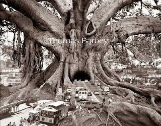
Thomas Barbey Alters photographs in a way to illustrate his metaphor. His idea for this came from Hollywood and he calls this work "Tourist Trap." On his gallery website he gives brief descriptions of all of his works. One of his artistic devices he used was, "There is no light at the end of the tunnel because you don't know if you will ever get out," says Barbey. The author clearly demonstrates his metaphor by having cars enter such a large tree with so many arms it represent the different routes you could end up on if you travel through the mysterious tunnel. Its mystical in that while you are traveling into the unknown you are also going in an unheard of manor, through a tree. In a way the picture uses the interxtuality of the tree of life in the Bible. Here taking a forbidden path means you may never get out of the tree's grasp. Much like in the Bible story where eating of the fruit will allow you to understand good and evil, going through the tree can change you from naive to knowing what maybe you didn't want to know if you hadn't gone this route. It makes the adventure all the more exciting and enticing not knowing what will be on the other side.


In another 
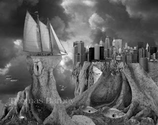
collaged photograph of Thomas Barbey's entitled "Fish out of Water" his metaphor is abundantly clear once again. Once artistic device he used in this photograph was the clouds in the background. It is very difficult when you feel as though you don't fit into the place you are residing. Here it is not smooth sailing for the ship which in my opinion represent the person. The clouds indicate a storm which most likely represent the feelings of the person that feels secluded in his own society. The artist/photographer perfectly places the ship on a separate piece of land as if it is stuck secluded. There being no water represents that there is no compromising ground to be made in this area where the person feels they do not belong. The artist draws the audience in by the abstract way of illustrating of a simply phrase we commonly use when something is out of place. He draws on your emotions and how you feel when you are the fish out of the water.